
Our Kitchen Refresh

When we first looked at the space, the foundation was already there. The cabinets are in great shape (just about 20 years old), the layout is open, functional, and works really well for our family. It wasn’t a kitchen that needed to be completely torn apart—it just needed to be reimagined.
Of course, no space is perfect. There are a few things I’d change in a heartbeat if we were doing a full gut renovation—like relocating the sink from the island—but that level of renovation isn’t realistic for us right now. Between budget considerations and life with a toddler (and a baby on the way), a full overhaul just isn’t the right fit for this season.
We saw the potential to transform this kitchen into something that feels both beautiful and highly functional—without starting from scratch. Through a thoughtful, phased refresh, we’ve been able to make impactful updates that truly changed how the space looks and lives.
I’m sharing this process in hopes of inspiring you to rethink any space in your home that isn’t quite working. You don’t always need a full renovation to create meaningful change—sometimes, the right adjustments can make all the difference. Whether you make all these same changes to your kitchen or just a few, I hope this helps!
Our Kitchen Before:

Refinished our floors
We were fortunate to have beautiful hardwood floors throughout our home, but they were covered in a high-gloss, orange-toned stain that felt dated and distracted from the character of the house. I knew refinishing them would make a huge impact on the overall feel of our home. While refinishing hardwood floors is a significant investment, it’s a project that is much easier to tackle before moving in, since it eliminates the challenge of moving furniture and living through the process.
My goal was to choose a stain color that would feel timeless rather than trend-driven while still honoring the traditional character of our home. After plenty of research, inspiration photos, and debate, I landed on a medium warm-brown tone. The next step was figuring out which stain would actually bring that vision to life on our white oak floors—a process that proved to be much more complicated than I expected.
My inspiration:

I was convinced that Minwax Weathered Oak would be the perfect stain for our floors. Based on my research, I was certain it would create the warm, natural look I wanted. But when our refinisher applied a sample to our actual floors, it looked much grayer than expected. It was a great reminder that stain colors can look completely different depending on the wood species, lighting, finish, etc. . Always test samples on your own floors before committing!
After a few sleepless nights and lots of second-guessing, I decided a custom stain blend was the best solution. I asked our refinisher to mix 50% Weathered Oak and 50% Special Walnut, and it ended up being exactly what I had envisioned—a warm, timeless brown that feels classic and complements the traditional character of our home.

Flooring Reveal:

Painted interior walls
Never underestimate the power of paint. Our previous wall color wasn’t offensive, but it definitely felt dated—a warm beige that had been there since the house was built over 20 years ago. It was time for a reset.
I’m a firm believer in creating a blank canvas, and for me that means a consistent paint color carried throughout the home (with the exception of those fun, intentional moments—think wallpaper or a fully color-drenched space). A warm, neutral white is always my go-to. It instantly freshens a space and creates a clean backdrop that lets everything else shine.
That said, not all whites are created equal. It’s so important to choose a tone that works specifically in your home, so always test swatches directly on your walls and live with them for a bit. Watch how they shift throughout the day in different lighting—it makes all the difference.
Designer note: If your goal is white walls, paint your trim the same white in a different finish (something with a bit more sheen). It creates a subtle, elevated contrast that feels really cohesive.
Repainting an entire home is definitely an investment, so if that’s not feasible, focus on the main living areas where you’ll feel the impact most. And if you’re moving—do it before you move in. It’s one of those things that’s exponentially easier (and cleaner) when the house is empty.
My paint color of choice:
Walls: Cloud White, Ben Moore (Matte Finish)
Trim: Cloud White, Ben Moore (Satin Finish)


Painted our cabinets
Painting the cabinets wasn’t part of the original plan. They were already a warm white, and I was determined to make them work. I even selected a warm white for the walls that I felt would complement them—something that wouldn’t push the cabinets into that overly yellow territory.
But once the walls were painted (in Cloud White), my concern became reality—the entire kitchen read yellow. It just wasn’t the fresh, balanced look I was after. That’s when my painter suggested spraying the cabinets with a lacquer in a color of my choosing, and it completely shifted the direction of the project.

I went back and forth on whether to lean into something more dramatic, but ultimately landed where I always do—timeless over trendy. A warm, neutral felt like the best long-term decision for both the space and the overall flow of the home.
That decision kicked off another paint color deep dive. Finding the right neutral is never as simple as it sounds, especially when it needs to work with fixed elements, lighting, and the rest of the house. After a lot of research, I landed on Natural Cream by Benjamin Moore. I did worry it might feel too dark, so we adjusted the formula to 75% strength—and it ended up being exactly what the space needed: soft, warm, and grounded without feeling heavy.
Designer note: If you’re unfamiliar with adjusting a paint formula, it simply means the paint store reduces the amount of colorant in the mix. Most colors can be customized in 25% increments—typically 25%, 50%, or 75% strength. The goal of this adjustment is to soften the color, making it lighter and less saturated, while still keeping the essence of the original shade.
Updated hardware
I went with an unlacquered brass. Rejuvenation is go my to for hardware! They have a ton of timless and fun hardware options in variety of beautiful finishes.


I really wanted to use the latch pulls below on some of my uppers, but they didn't line up properly with my overlay cabinets.

Designer note:
Mixing different styles of hardware within the same finish is an easy way to elevate your kitchen and create a more custom, layered look. Using two to three complementary hardware styles adds visual interest while still feeling cohesive and intentional. Any more than that can start to feel busy and take away from the overall design.
Swapped Out Our Pendants
Three pendants over the island felt too busy for the scale of the kitchen, and I also wasn’t loving the inexpensive-looking brass finish. Instead, I waited months for this beautiful linear chandelier from Visual Comfort. The linen shades introduce a softer, more organic material to the space, and the subtle leather detailing adds another thoughtful layer of texture.
Lighting is one of the best opportunities to bring personality into a space. If you’re not finding the right pendant for your kitchen, it’s often a sign to think beyond the expected and choose a fixture that truly speaks to you—something that feels intentional, elevated, and aligned with the overall design.


Replaced our counter tops and backsplash
Swapping out our countertops and backsplash was one of the most exciting parts of the renovation process. It completely transformed the feel of the kitchen and was such a fun design moment to bring together.
From the beginning, I knew I wanted a few key elements: the same stone to carry from the countertops up into the backsplash for a seamless look, and a small stone ledge at the top of the backsplash for added detail and function.
What I wasn’t as clear on was the overall direction. Did I want to lean moody and dramatic with soapstone, or keep things light and airy with a quartzite? That decision became the real design challenge—and ultimately shaped the entire mood of the space.
Soap Stone Inspiration

Lighter Quartzite Inspiration:

I removed one of my cabinet doors and brought it with me to Marble & Granite in Westwood, MA to explore their stone selection in person.
I was so excited when I came across this quartzite slab in a honed finish, especially because it had a perfectly coordinating second slab—which I needed for the full project. I loved the movement in the stone and the balance of warm and cool tones; it felt like the perfect blend of interest and timelessness.
Since Marble & Granite is a stone supplier and not a fabricator, I needed to find a team to handle the full installation process. That included removing the existing countertops and backsplash, templating, cutting, and installing the new stone. I ended up working with Earthworks in Braintree, and they did an incredible job—everything came together seamlessly and they were a pleasure to work with throughout the process.

Slabs Installed:

Ordered new counter stools
Buying counter stools and dining chairs can feel overwhelming, especially when you’re purchasing multiple at once and trying to balance style, comfort, and budget. My goal was to find something beautiful and well-designed without overspending.
After browsing my favorite online retailers, I came across these counter stools from Wayfair that honestly felt too good to be true for how good they looked. The reviews were encouraging, so I decided to order one first to test it out before committing to the full set of three additional stools.
Overall, I’ve been really pleased with them. I do plan to eventually recover the cushions in a more durable performance fabric, but I love the contrast of the dark wood legs and the woven texture—it adds another natural material and layer of warmth to the kitchen.

Modernized Our Range Hood
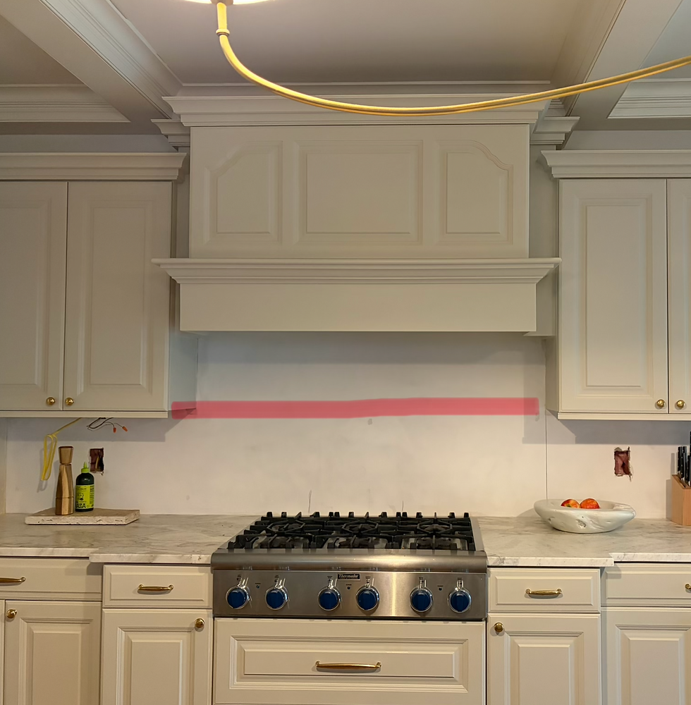
As I mentioned earlier, our cabinets were in great shape overall, but there were a few details that felt a bit too ornate—most notably the hood. I knew it wouldn’t be a major lift for our carpenter to update the surrounding paneling and simplify the design.
Phil Holda (Handyman Holda) is truly the best. I shared my inspiration images with him, and he brought the vision to life perfectly. I wanted a clean, simple flat-front hood with subtle trim detail at the bottom, and the final result feels so much more streamlined and aligned with the rest of the kitchen.
The Before:
The Inspiration:

The Result:

Designer Note:
Always share an inspiration image with your carpenter, painter, fabricator, contractor—anyone bringing your vision to life. Even simple terms can be interpreted differently; for example, “thick crown molding” can mean something entirely different from person to person. A clear visual reference eliminates guesswork, aligns expectations, and helps ensure everyone is working toward the same result from the start.
Styled With Intention
Finally, the construction work was complete, but the space still didn’t feel fully finished. My goal at that point was to layer in kitchenware and accessories that were both beautiful and functional, without overcrowding the countertops or stone ledge.
The final step was all about restraint and intention—selecting pieces that added warmth, texture, and usability while still allowing the materials and design of the kitchen to shine. Below are the finished results and the accessories I chose to complete the space.
Accessories:

Art: I got this framed Mckenzie Dove painting on my recent trip to Rosemary Beach. I wanted something simple with neutral colors.
Salt & Pepper Mills: I've been avoiding splurging on these salt & pepper mills from Cove Home, but I finally ordered them and have no regrets! They are great quality, hold a lot of salt and pepper, and are very easy to use.
Plant & Planter: The planter is from Homegoods and the plant is from Trader Joes.
Olive Oil Dispenser: This is from homegoods too! I wanted something simple, and put my money towards the salt & pepper mills instead.
Fruit Bowl: I got this bowl from CB2 years ago and its not longer made. There are so many good fruit bowl options out there!
Cutting Boards: These are from World Market, great quality and made of teak!
If you've made it this far, thank you for your support! I hope you found something inspiring or useful from this blog :)


Comments